I’ve made a few updates to my EDC (everyday catch-all) and finally have an aesthetic theme for my 2025 setup. I’m going for muted neutrals of taupes, tans, and greens with pops of gold for a little flare. I have 3 sections in my planner and I’ll break them down below.
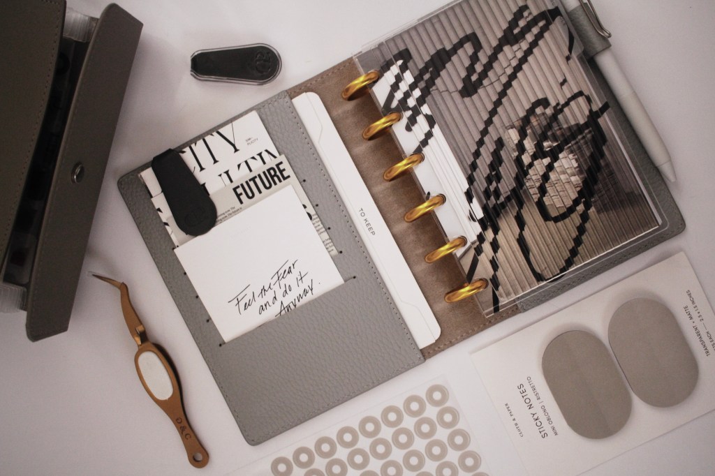
The first section in my planner is key to my aesthetic theme for my planner. I have the FLUTED DASHBOARD layered on top of the black abstract cover from the AS WE ARE DASHBOARD SET with the base being the GALLERY DASHBOARD. I like for my initial cover to be heavily layered with different textures, prints, and tones. This color theme will also be carried out through the rest of my planner. For the rest of this section I have a YEAR AT A GLANCE layered on top of my YEAR OVERVIEW. As I only keep about 3-4 months in my schedule section at a time I like to write key things in the year overview and remove whatever months that are no longer in rotation. This constant swap out of months helps me keep my planner with less bulk while still being efficient for my needs.
My next 2 sections are separated with the ESSENTIAL SIDE TAB DIVIDERS. The section first up is for my schedule. To start I have the ENCORE DASHBOARD and the section is comprised of the DATED ADMIN INSERTS, which include monthly’s on one page and weekly’s on one page. I have the month separated with MONTHLY DIVIDERS and at the start of each month I have the UNDATED DAILY GRAPH that I use as a template to how I like my daily tasks to transpire. I also have the KABAN TASK TRACKER directly after that to keep track of any ongoing tasks/goals I’m working on.
My last section is for notes and contains the NOTABLE SECTION COVER layered on top of the SANGUINE DASHBOARDwhich was once a sub box exclusive but it’s finally available for purchase. Also in the section I have the COLUMN NOTE TAKING INSERT. I love this insert to quickly jot down brainstorming items, along with plans I’m working through for the upcoming months and any ongoing lists I may need to create.
As far as accessories, I loved how these 1 IN GOLD DISCS paired with my VELETA FOLIO COVER and NORI PAPERCLIP, which is this deep shade of green that brings my muted neutral theme together.
*links listed are affiliate links that earn me a small commission for any purchases made at no additional cost to you

Leave a comment